Starting meaningful collaborations can often lead to transformative outcomes for organizations. Such as the opportunity was had when connecting with Emma, a Communication Manager at Awabakal Ltd. We initially were engaged to bring to life a logo for their Healthy Ways program and later re-engaged to develop a complementary Smoke-Free Zone sticker design that intertwined the look and feel of the logo they loved.
Awabakal Ltd is a vital Aboriginal Medical Service in the Hunter region that serves over 8,000 patients of all ages, from babies to elderly clients. Many of their patients suffer from chronic diseases, such as mental illness, diabetes, and obesity. However, these conditions can often be improved through exercise and a healthy diet which is why their Healthy Ways program came into fruition.
With a mission to amplify their efforts and inspire participation in healthier lifestyles, Awabakal Ltd initiated the “Healthy Ways” 10-week program. This initiative encourages engagement in various activities, providing participants with a pathway to improved well-being. Participants are assessed at weeks 1, 5, and 10, with recognition for those who complete the full program or achieve significant improvements.
Gather & Create
We came together as a team and explored the project of which Lauren and Leticia collaboratively brought to life 2 different design concepts and directions embracing their font selection and colour palette from the vibrant Awabakal brand identity.
Story behind the logo
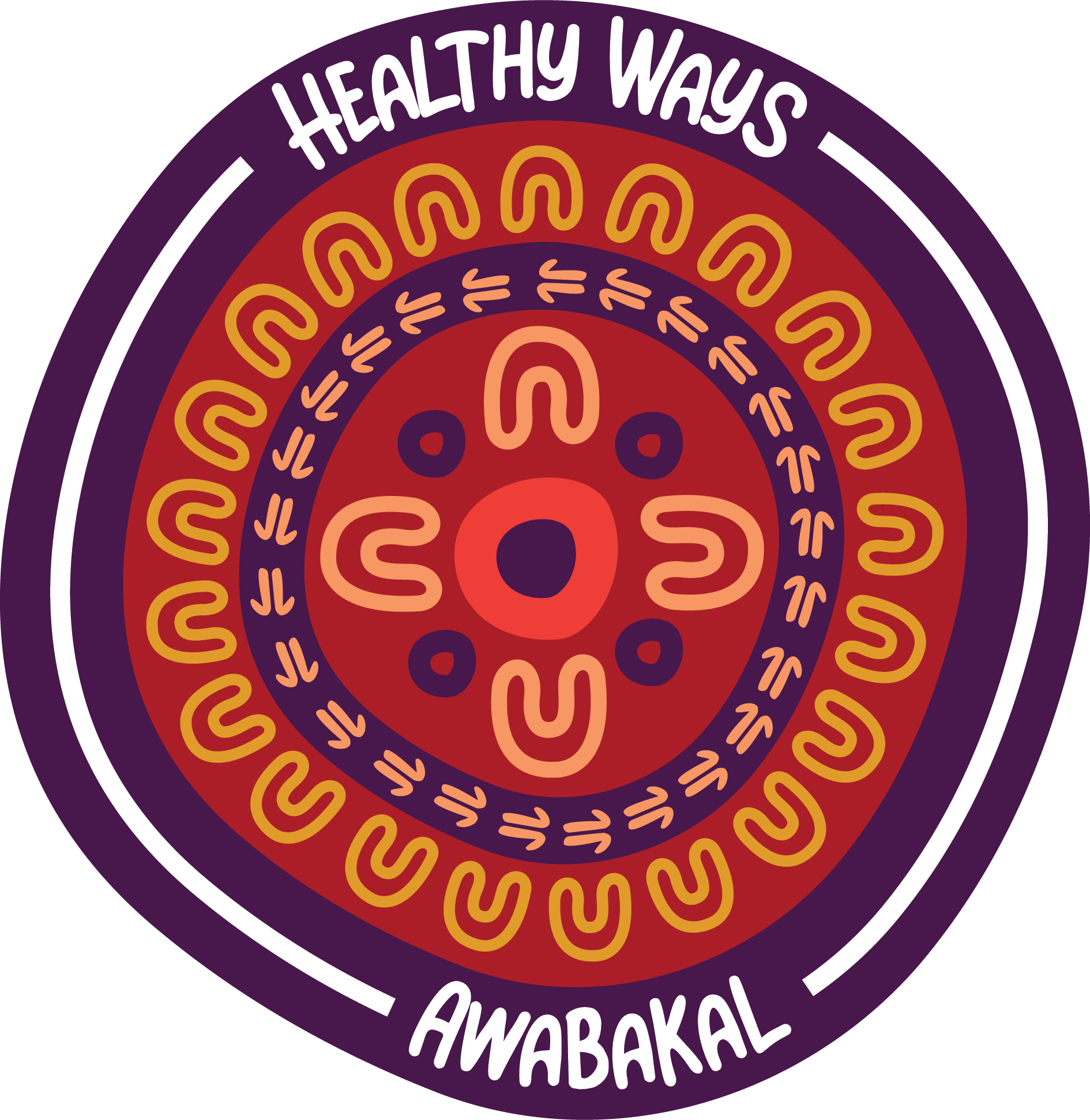
The meaning behind the logo acknowledges and respects that health is a holistic approach meaning that physical health is only one aspect of health and wellbeing. It recognises that there are many components to health, including spirituality, community, mental health, physical health and emotional health. The yarning circle in the centre represents Awabakal and the outer layer of people represents the community impact that Awabakal has on the communities they service. It represents a transference of knowledge, support and connection.
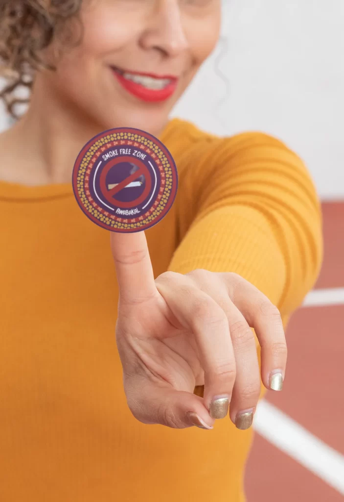
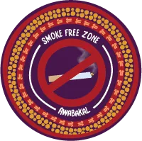
Lauren also had the opportunity to bring to life a sticker design for their Smoke-Free campaign that Awabakal wished to tie into their Healthy Ways logo look and feel. We were able to coordinate the printing of merchandise through our supplier such as sticks and magnets for the program to deliver to the community
Share & Embrace
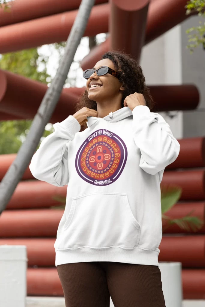
The logo we created for Awabakal’s “Healthy Ways” was embraced within their AMS but also community. They were able to use it on their landing page, social media, and even on merch like shirts, water bottles, caps, and tote bags. We love getting to created designs for community-focused initiatives as one of our primary target audiences within Yirra Miya. We take pride in contributing to the creation of a visual identity that aligns with Awabakal Ltd’s mission and empowers staff and patients to embrace healthier choices.
It’s heartening to have played a role in Awabakal’s endeavor to promote wellness, and we’re excited about the impact the “Healthy Ways” program will continue to have on their community.

