Caroline Kell’s journey is one of strength and resilience, rooted in her identity as a proud Mbarbrum woman born and raised on Kulin lands in Naarm (Melbourne). Her life has been marked by challenges like poverty, grief, loss, trauma, and family violence during her formative years. However, it was through overcoming, healing and growing, that it ignited her passion to uplift Indigenous communities by enhancing their social-emotional well-being. This transformative path laid the foundation for the birth of Blak Wattle Coaching.
When we engaged in conversation with Caroline about her business visual identity and goals, it became apparent that she was seeking a brand transformation. Caroline recognised the need for her branding to more accurately convey her messages and resonate with her ideal audience – First Nations people and communities. After exploring our services, Caroline embraced our Goanna Branding Package. In collaboration, we brought to life her brand, aligning it with Caroline’s unwavering vision.
Gather & Create
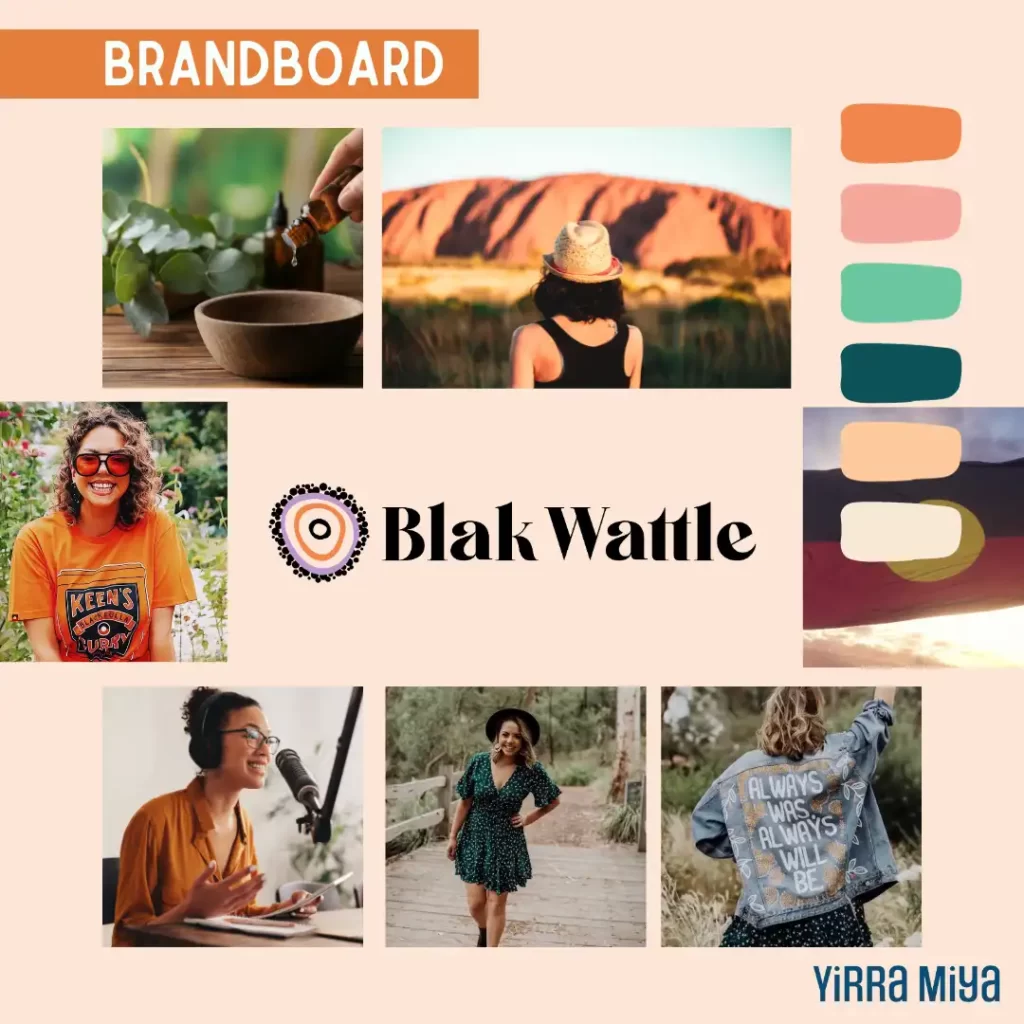
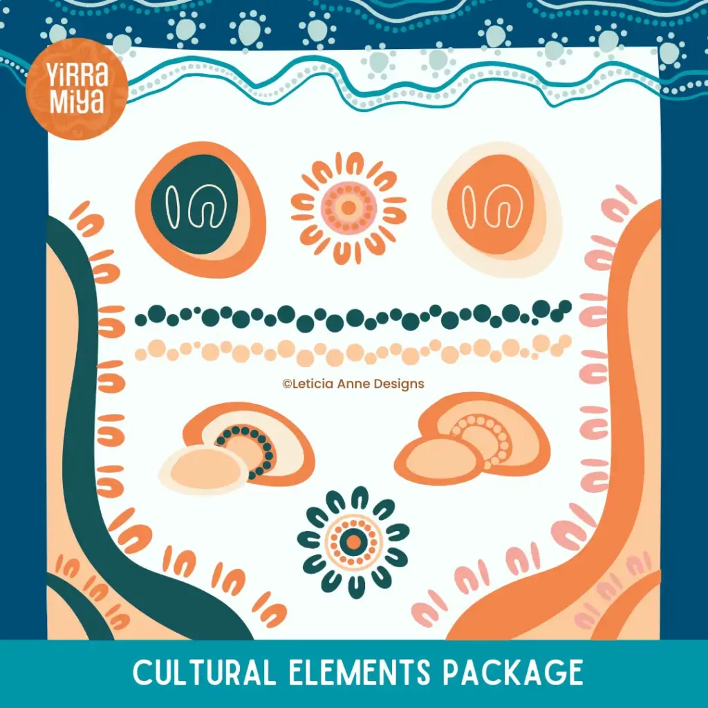
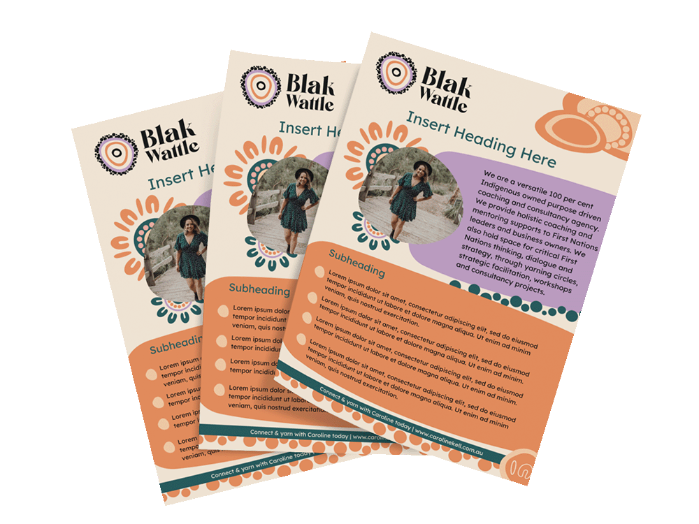
Throughout the process of crafting Blak Wattle Coaching’s distinctive branding elements, we held onto the insights Caroline shared during the transformative Brand Discovery Workshop. Armed with her aspirations, we brought to life a diverse array of impactful assets. These encompassed a captivating logo, a collection of culturally resonant illustrations, a versatile Canva Flyer template, Instagram highlights, and meticulously designed report templates. The heart and spirit of this branding journey was creating the logo for Blak Wattle.
Story behind the logo
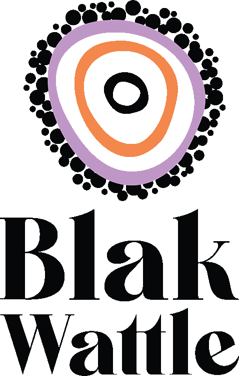
At the core of Blak Wattle Coaching’s logo lies a profound narrative. It represents three layers of Cultural knowledge: Caroline at the heart, surrounded by the wisdom of her parents and grandparents. The delicate dots encircling the meeting circles symbolise the exquisite and beautiful follicles of the wattle plant, presented in an abstract form. The font selection strikes a harmonious balance between boldness and femininity, a deliberate nod to her intended audience – empowered Indigenous women.
For Blak Wattle Coaching’s Style Sheet, we gravitated towards these beliefs in developing the assets:
Healing
Bold
Energetic
Confident
Empowering
Culture
Original
Authentic
Share & Embrace
As we wrapped up this creative journey, there was a sense of honour and excitement when Caroline revealed her logo. Seeing her embrace the new brand identity with a smile and share the story behind its design was truly heart-warming. Just like Caroline’s commitment to her community and to First Nations people across our nations – her new brand highlights the power of connection, storytelling and collaboration. Every step of the process was carefully thought out to give Blak Wattle Coaching its true essence.