Menu
Branding
Tyla’s Brow Studio
2021

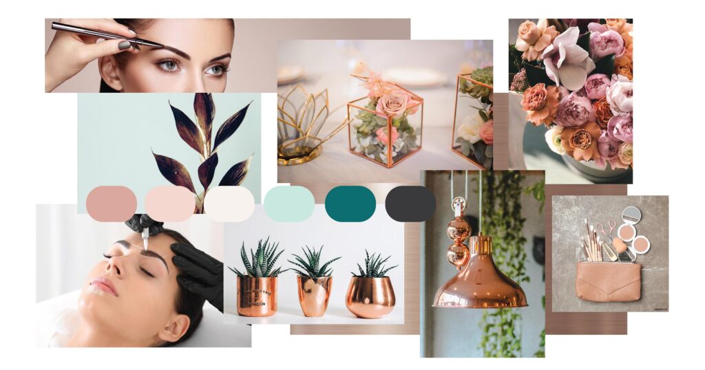
When it came to designing Tyla’s logo, we went through the journey of clarifying her visions and ideas through creating a mood board of inspiration. From here I developed some initial concepts to explore her direction further. Tyla decided on having a word mark, to step away from the generic eyebrow icon logo and to have something that was elegant yet represent her business.
We then developed a style guide that lead the rest of the way, as we journeyed through fonts, colours, key words and brand direction, and her imagery mood board.
Having a style guide is important as it helps build consistency across all of your branding collateral. Consistency then helps build connection for people to remember your business identity by, but most importantly, connection to trust, explore and to remember and know what your business is all about.


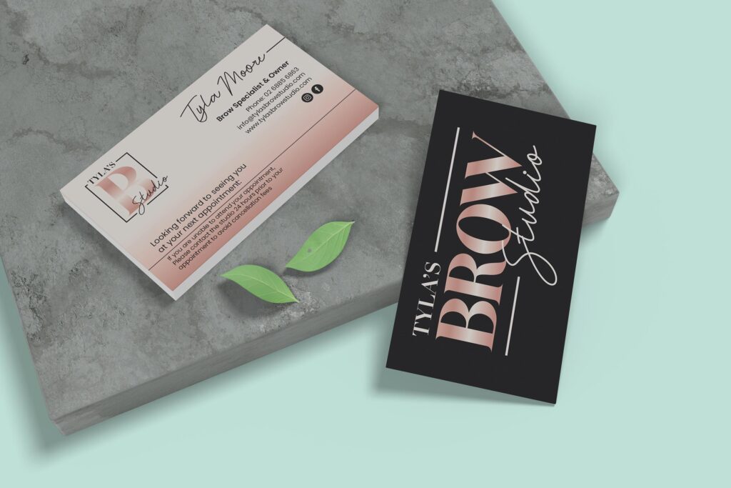
Tyla decided on a minimalist design on the back to really help her logo pop with the rose gold on top of this gorgeous Charcoal Grey.
We then developed something that remained true to her branding key elements and aspects that were highlighted in her style sheet with showing off her submark logo.
Little surprise; they are also appointment cards for Tyla to book in her next client appts!


We would like to acknowledge the Nations of which we come from, live upon and create within. We’d like to acknowledge and pay our respects to our Elders past, present and future emerging. We’d also like to extend our gratitude for the gifts from Mother Earth, our Ancestors, our Creators and our communities. We thank them for the knowledge and guidance we embrace as proud First Nations people embarking on our creative journeys and having the space to share through cultural storytelling and design. We therefore, would like to say GAWAYMBANHA ‘Welcome’ as you join us in YIRRA MIYA ‘growing together’.